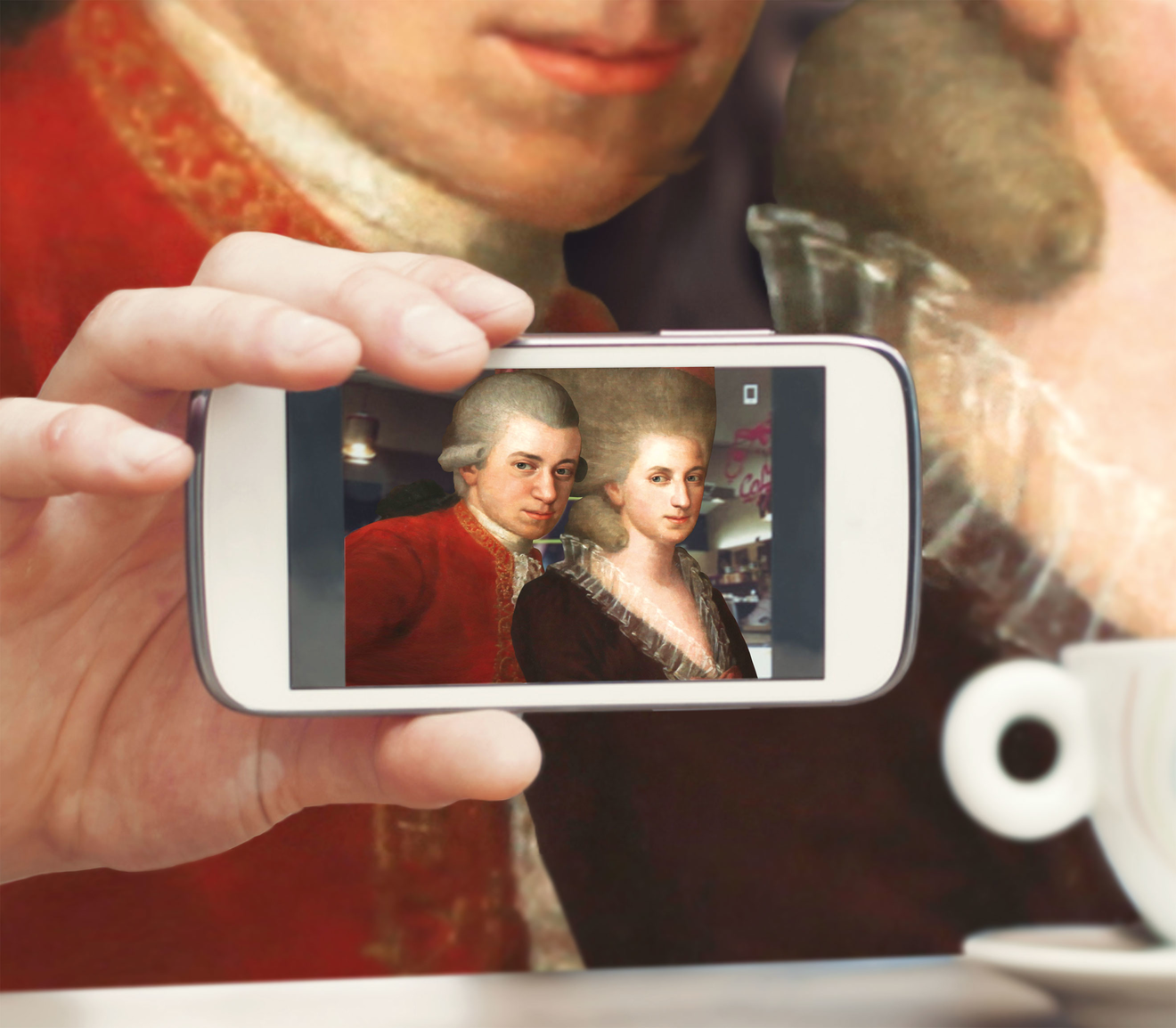
Amadeus 2.0
After several decades of programmatic evolution, the Mozartfest Würzburg was projecting a visual identity that was not consistent with the festival’s cultural offerings. Q was asked to expand the visual perspective from the past toward the present.After several decades of programmatic evolution, the Mozartfest Würzburg was projecting a visual identity that was not consistent with the festival’s cultural offerings. Q was asked to expand the visual perspective from the past toward the present.
THE GOAL
THE LOGOTYPE


THE PROGRAM BOOK
The audience – 25,000 guests per year – learned about the new design in two phases: In the first three years, the new “M” was displayed prominently on the cover of the program brochures. The red booklets echoed the visual appearance of previous years, but they also reinforced the new design concept. Today – after the successful introduction phase – the “M” is positioned smaller on the bottom right of the brochure and the guiding theme is brought to the foreground.
In addition to the basic layout, Q is also responsible for the image spreads. (Typesetting is provided by a freelance designer in Würzburg.)


THE WEBSITE
