Less is mre
An open square lends distinction to the corporate design for a new museum for abstract art, coming soon to Wiesbaden. Q competed successfully in an agency pitch for the museum’s visual identity and its application in all media.An open square lends distinction to the corporate design for a new museum for abstract art, coming soon to Wiesbaden. Q competed successfully in an agency pitch for the museum’s visual identity and its application in all media.
BRIEF
The Sonja and Reinhard Ernst Foundation is planning to open a new museum for abstract art in Wiesbaden in 2023. For an agency pitch conducted in March of 2018, Q was asked to propose concepts for a visual identity. Eight days after our presentation, Reinhard Ernst told us that one of our proposals was selected as the winning concept.
The name of the museum will be Museum Reinhard Ernst, so the foundation asked us to include the acronym MRE in our creative process.
Our goal was to create a visual identity that can communicate a homogeneous image of the building, promote awareness of the new museum, and generate public interest in this major addition to Wiesbaden’s cultural offerings. The logo plays a siginificant role. It must be appropriate for an abstract-art museum, and it must be recognizable even in black-and-white versions, in small proportions, and in both printed and electronic media.
IDEA
Three thoughts guided our creation of the winning identity:
- Because abstraction is the process of omitting parts or elements, we cut out a portion of the letter forms in the acronym.
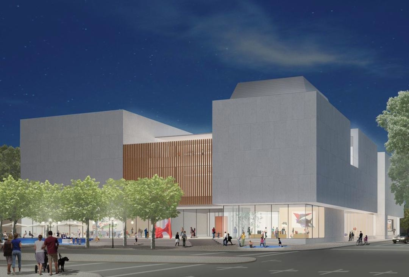
- The museum’s building, designed by famous Japanese architect Fumihiko Maki, is based on a distinctive concept: Viewed from from above, the building’s plan reveals that a large square atrium is cut out of the building corpus.
- The square open space symbolizes paintings or works of art that will be displayed in the museum. It also conveys a sense of the mental openness that we practice while contemplating abstract art.
DESIGN
The logo is not a visual symbol. Instead three letters combine to form an emblematic, recognizable and stable shape. The letterforms are arranged in a meaningful hierarchy: Under the sheltering M (for museum), the letters R and E (for Reinhard Ernst) stand next to each other to create a compact body. Despite the cut-out abstraction, the letters are still legible. The mind of the viewer adds the missing parts.
For this acronym, we used lower-case letters from Helvetica, probably the most objective typeface in the world. The font, created 1956, is omnipresent throughout the world and spans the time of the art displayed in the museum (paintings, photography, and sculpture from the 1950s to the present). Helvetica does not claim do be decorative or fashionable. Instead it’s rather timeless. With its informal character, it enables all labeled items to unfold their personalities. The informal approach also required us to avoid colorful accents; the acronym is either black or white, depending on the background.


LAYOUTS
ABOUT THE MUSEUM
The collection includes work by Karl Otto Götz, Emil Schumacher, Peter Brüning, Fred Thieler, Kazuo Shiraga, Günther Uecker, Robert Motherwell, Jackson Pollock and many others. Works by the American artist Helen Frankenthaler are an important component of the Collection Ernst.
With its large collection, the Museum Reinhard Ernst is well situated for global art lending and exchanges with internationally recognized museums. This assures that, in addition to permanent exhibitions, the museum can present exceptional special shows. The exhibitions will present more than paintings. For example, when it opens, the museum will present a retrospective survey of Fumihiko Maki’s architecture career. Later, an exhibition of photography by Wolfgang Tillmanns might be organized. In close coordination with the neighboring art institutions (Museum Wiesbaden, Nassauischer Kunstverein), joint exhibitions will cover comprehensive subjects.
The museum will become an attractive venue for national and international visitors. But above all, it will be a new art institution for the citizens of Wiesbaden. Beyond art, the building will include a café, a museums shop, offerings for children, and a forum for various events. The new building will join an appealing cultural axis in central Wiesbaden: the RheinMain CongressCenter, the Museum Wiesbaden, the Museum Reinhard Ernst, Nassauischer Kunstverein, Villa Clementine, Presseclub, Hessisches Staatstheater, and the Kurhaus.
