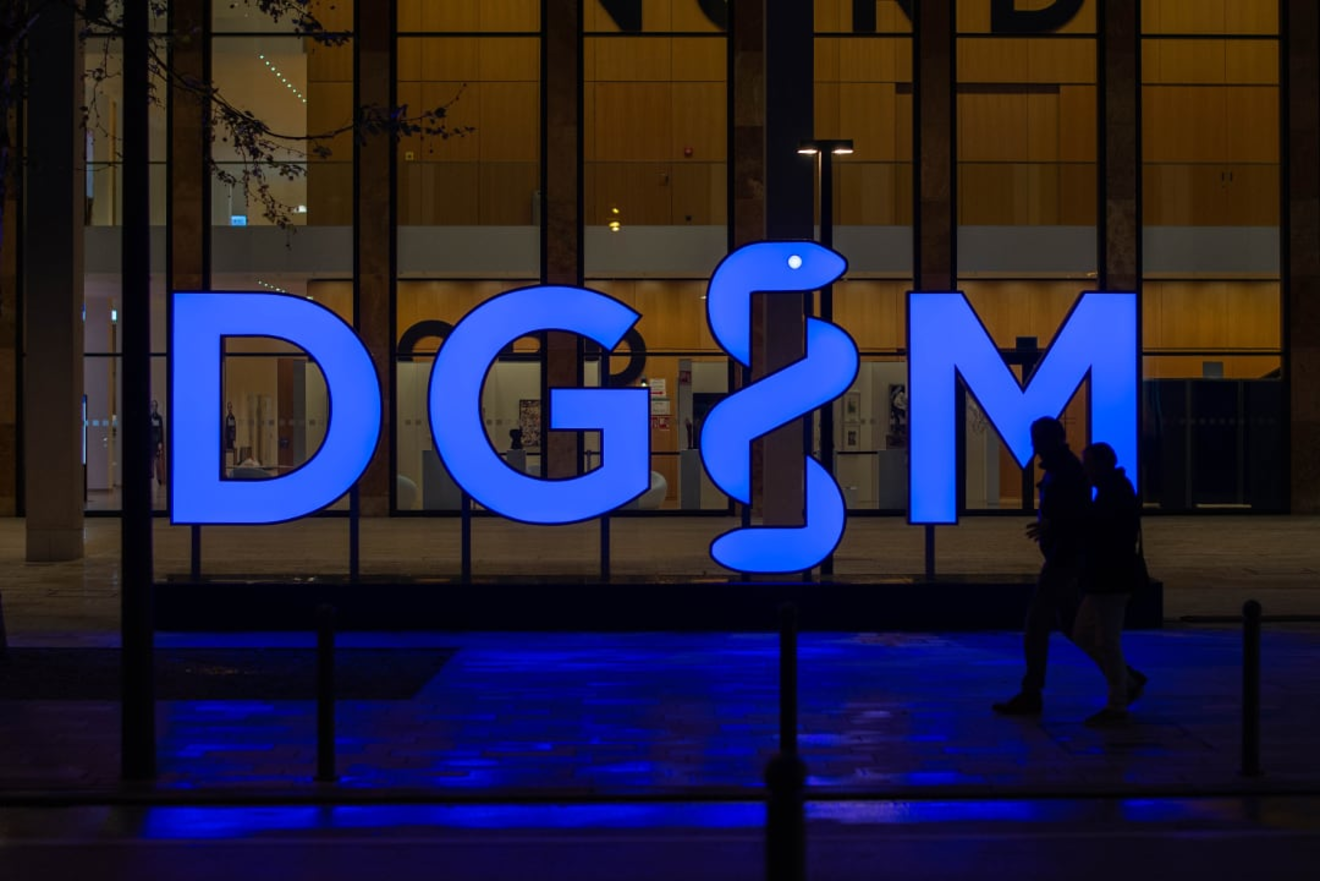
Watch out for the snake!
THE TASK
With more than 26,000 members, the Deutsche Gesellschaft für Innere Medizin (German Association for Internal Medicine) is among the most significant professional associations in Europe. It represents the interests of all German internists. Some of the most famous European scientists were members of the DGIM: Robert Koch, Wilhelm Conrad Röntgen, Emil von Behring, and Albert Schweitzer. On the occasion of the 125th DGIM Congress of Internists and the 200th birthday of the association’s founder, the steering committee and management board selected Q as an acknowledged agency for smart corporate design solutions and asked our team to renew the 20-year-old DGIM brand identity.


THE CHALLENGE
The old logotype – four letters in a circle – was weak in the areas of functionality, aesthetics, and content:
- First, the logo was effective only in multicolor applications. In its achromatic form, there was no distinction between the I and the M. The accentuation of the I (for Internal) and the intended differentiation from other medical associations was obscured.
- Secondly, the serifs – the short lines at the upper and lower ends of the letters’ strokes – were much too tight. Displayed in small proportions, the characters abutted.
- Thirdly, the dull color scheme and the selection of an old Antiqua font did not suggest an energetic professional association that looks toward the future, promotes innovative research, and renders outstanding services to young medical professionals (for example, by awarding grants and Young Talent awards).
In the creative brief for a newly designed acronym, the association insisted that even laymen should recognize that DGIM is a medical group. After all, the various DGIM activities reach far beyond the borders of internal-medicine practices and hospitals. For example, the annual four-day Congress of Internists (8,000 attendees) is one of the largest medical conferences in the German-speaking countries. It is a major event for the host city and its citizens.


THE SOLUTION
We carefully selected a contemporary typeface – modern but not fashionable – and assembled the four letters in an arrangement that leaves no doubt about the reading order. The quiet chromaticity was replaced by a radiant blue, its brightness emphasizing DGIM’s strong energy. Even without color, inverted or seen from the distance, the design is well understood and memorable. To emphasize the professional context, a snake form curls around the negative white letter I and transforms the row of characters into a pictorial symbol. Originally, the rod of Asclepios was an attribute of the god of medical science. Today, Asclepios’ staff is the common symbol of the medical fraternity. Placing the Aesculapian snake in a medical context isn’t a new idea, but our juxtaposition of designed and spare areas explored a new path to emphasize a single essential letter.


THE REALIZATION
Step by step, we transferred the numerous DGIM media into the new design theme. This redesign is not only about updating digital and printed communication materials, but also includes the relaunch of several subbrands. The blue snake is always a distinguishing element of the new visual direction. We also created a corporate design manual to guide DGIM contractors as new applications evolve.


