Typographic lobbyism
THE SITUATION
In the year 2021, Microsoft officially announced that it will replace its default font, Calibri, after 15 years. The company presented five alternative typefaces and asked the world to vote for the new official font to be used in all the Microsoft Office apps. We were especially intrigued by this announcement, because the font candidates are Tenorite, Skeena, Grandview, Seaford — and Bierstadt!
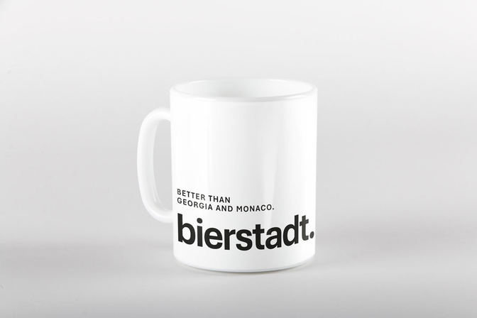
Bierstadt is a borough of the city of Wiesbaden, Germany, located directly east of downtown. In Wiesbaden, we completed our graphic design education, and in Wiesbaden, we manage our creative studio Q. Many of our team members, clients, friends and families live in Wiesbaden — some in Bierstadt. So it was clear as daylight: We have to make sure that a font with that name wins the race, and more than one billion people will have to deal with Bierstadt when they use their Microsoft apps, starting in 2023. This would gain great popularity for an international mostly unknown urban district.
THE PLAN


THE GOAL
Of course we took notice that the designer of Bierstadt, Steve Matteson, was inspired by a peak in the Rocky Mountains named after the landscape painter Albert Bierstadt. But of course “our” Bierstadt is much nearer to our heart. There should be no getting round Wiesbaden whenever people encounter and search for the name. With generous support from the Wiesbaden city marketing agency, the local press, and a great network of friends in Ann Arbor, Palm Springs, Québec and Sterzing, we are quite confident that we’ll achieve a common goal: Bierstadt will become the next default typeface of Microsoft!


GOOD REASONS
Ties to our hometown alone are not enough of an argument for the worldwide use of Bierstadt. But even after closer typographic analysis, our favorite comes out on top.
Since typefaces all speak in a unique tone of voice, a default font should be somewhat neutral and able to speak in many different voices, adapting to many different styles of typography. Very classical typefaces will look awkward in modern settings. Types that are too modern will look awkward in classical settings. Bierstadt balances classical and modernist attributes allowing it to work well in many different stylized layouts. But what about the four competitors?
- Tenorite, being a geometric sans, is mostly relegated to display typography and not extended text. It speaks in a modernist tone that limits it’s appropriateness for formal documents. Its geometric shapes make words very wide thereby limiting how much information can be included in a mobile environment or in narrow columns. Some irregularity in spacing shows up in headlines: We typed “lol” in the italic and found the “o” to be shifted slightly to the right. The lowercase “u” looks too tight on the right in the roman. The lowercase “l” and “L” appear very loose compared to the right side of “m” and “n” The “s” looks like it is tipping backward and the terminal strokes look pinched compared to “e” and “c”.
- Seaford – while a very lovely design – is limited by its calligraphic and classical voice. It is very legible for extended text – its skeleton is based on serif text typefaces – but only speaks in a serious tone. Oddly the “A” and “V” are spaced very loosely to straight stems. (We typed the word AIR and felt like it was A<space>IR.)
- Skeena – another lovely design – is very much branded in a formal voice. It is highly legible and excellent for office-related documents. It is less suited, however, for modern or technical looking design.
- Grandview is stylistically the most neutral but lacks elegance or a pleasantness to read. Suitable for assembly instructions or traffic signs but little else. Its design was inspired by the German DIN standard. Some of the details, including the very wide “r” and “s” and equally narrow “t” prove distracting to read in text. The internationally renowned typographer Erik Spiekermann even finds: “Grandview is a butchered copy of DIN.”


